Work / Juniper Concept project
Making a small yoga studio easy to start with.
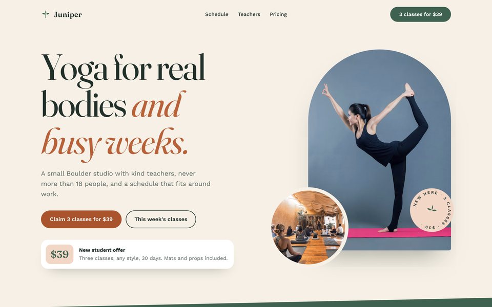
Juniper is a small, friendly studio competing with big chains and apps. We designed a warm brand and a website that makes the first class feel easy, with a clear intro offer and a filterable schedule.

The challenge
What wasn't working
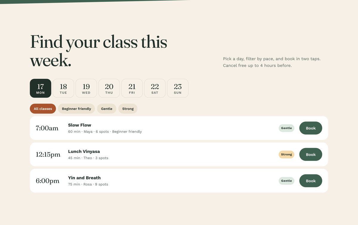
New students struggled to find a class that suited them. The schedule was a PDF, and class names didn't say whether they were gentle or strong.
The intro offer existed, but it was hidden on a pricing page most visitors never reached.
"People are nervous about their first class."
Adults in Boulder aged 25 to 55, many new to yoga or returning after a break, who want a welcoming studio rather than a fitness chain.
Goals
What the new brand and website had to do
More first visits
Make the intro offer impossible to miss.
The right first class
Help beginners find a suitable class.
Members, not drop-ins
Guide new students toward membership.
What we learned
Insights that shaped the design
Clear levels and a beginner filter reduce the fear of the wrong class.
"3 classes for $39" is easy to say yes to.
Class sizes and named teachers set a studio apart from chains.
Brand solution
Warm, earthy and welcoming
Aa Bb 123
Color palette
Voice and tone
Kind, encouraging and down to earth. Never assumes flexibility or experience.
- Welcoming
- Grounded
- Encouraging
- Small
Website solution
Key design decisions
Each decision is linked to the goal it supports.
Intro offer in the navigation
"3 classes for $39" is the main call to action everywhere.
Goal 1: More first visitsFilterable class schedule
Filter by beginner friendly, gentle or strong, then book.
Goal 2: The right first classArch-framed photography
Photos sit inside soft arches, giving the brand a shape people remember.
Goal 1: More first visitsTeachers by name
Each teacher has a photo, their classes and years of teaching, so the studio feels personal.
Goal 1: More first visitsGoal 3: Members, not drop-insMembership tile as best value
Shows the path from intro offer to membership.
Goal 3: Members, not drop-ins
Desktop and mobile
Designed for the phone first

Measuring success
How we'd know it's working
| What we track | Target | Design decision that supports it |
|---|---|---|
| Intro offers claimed per month | Steady growth | Offer in the nav and hero |
| First classes rated beginner friendly | Over 70% | Beginner filter on the schedule |
| Intro students who become members | Above 30% | Membership shown as the next step |
| Schedule views to bookings | Above 15% | Book buttons on every class |
This is a concept project based on a fictional brief, so these are the targets the design is built to reach, not reported results. For client projects, we agree targets like these at kickoff and report against them after launch.
Try it yourself
See the live concept website
Open the working site and try it on your phone.

Next project